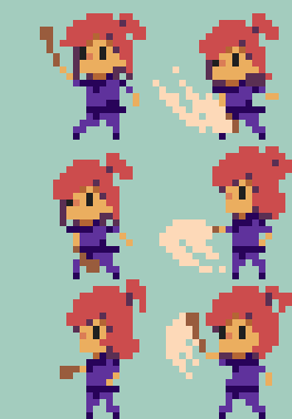
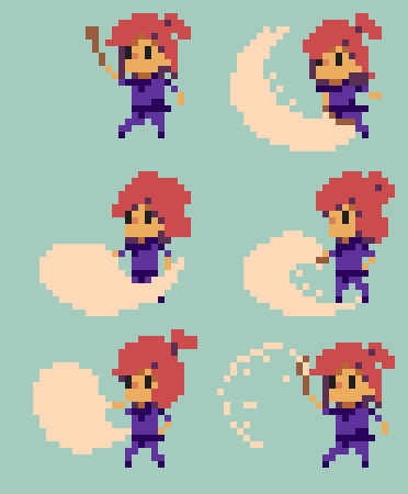
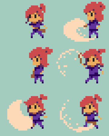
We are officially two weeks deep into Dungeon Sandwich, and we’re right on schedule! The character is fully animated and can run around in-engine to smack things with her comedically large wooden spoon. In addition to this, the dungeon is now being procedurally generated. We have basic UI currently implemented, and we’re waiting to hear back from a contract artist for some high-quality pixel art assets.
Character Overview I drafted several character variations. I’m a huge fan of the Sword and Sworcery minimalist style, but it didn’t feel right for this top down hack and slash game. After several iterations the playable character turned into a white girl with strawberry hair. Originally, we wanted to give the player a random character each time they died and had to start over. I had drafted up palettes for different clothing/skin/hair combinations. However due to time constraints we went with our original strawberry haired heroine simply because she was the furthest refined. Her pony tail also lent itself to making the animation feel bouncy as well!

Animation took several iterations again. We miscounted the animation sets initially and created more work than originally planned. The sets of animation that were the most challenging were the multi-direction roll and attack frames. Once all the frames were compiled, I took everything into Spine and tied all the animations together.
It has been about a year and a half since I’ve used Spine, so it took me a few hours to relearn the program and to troubleshoot a bug we encountered on the Unity implementation side. As of now the animation is implemented and looking solid. The next step is to tweak the controls and refine movement and speed. We’ll also need to add freeze frames for successful hits, and add some screen shake for good measure!
Level Overview
So I’ll be the first to admit I got carried away and designed about 240 wall variations and components. Most of the variations are minimal as we’re tackling a simplified, flat art style, but they are there! I really love the idea of having a TON of variations of assets so that the dungeon feels handcrafted.
For planning dungeon generation we referenced Mark Brown’s channel, Game Maker’s Toolkit, along with bits and pieces of the Spelunky book by Derek Yu. As a designer, I love the idea of finding the balance between lovingly handcrafted content and procedural generation.
Our dungeon generation is currently printing out these. Far from finished, but on the right track!


コメント